Page 1 of 2
Website makeover
Posted: Sat Jan 07, 2012 12:25 pm
by Dave Brown
The problem with having a website with pages is that you periodically look at it and say "My god, did I write that

" Well I'm at that stage for a thrid time now on some to the web pages

Aidan had been working hard on a new version of the website over Christmas and the beta version is now being tested by me. It makes creating pages and keeping them to a similar format much easier, through I still have to think a lot about what is written.
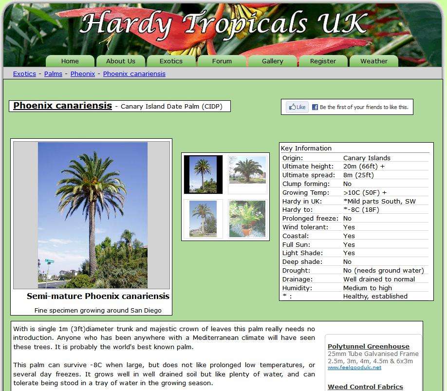
The new format tries to give more info in a 'key list' format. so that viewers can gain more info without having to read the whole blurb on the page, it is there for further info if required. We have also added a Facebook like button, and other features are being talked about at this time.
Anyway I have populated a couple of pages get the feel of the new methods of creating and Phoenix canariensis is one of the first. This is not the whole page, but gives an idea of what info will be on the page and the style.
Re: Website makeover
Posted: Sat Jan 07, 2012 12:40 pm
by GoggleboxUK
Good idea Dave, I think 'bite-size' portions of information with the option to learn more is always a good way of presenting onternet content, not too cluttered either.
Give me a shout if you need any help with images or designs.

Re: Website makeover
Posted: Sat Jan 07, 2012 1:17 pm
by Yorkshire Kris
Excellent news Dave. I will keep checking the " Exotics" section.
Re: Website makeover
Posted: Sat Jan 07, 2012 1:17 pm
by Mr List
nice but could do with the same colour scheme as the forums instead of black and white
Re: Website makeover
Posted: Sat Jan 07, 2012 4:02 pm
by kata
It looks a nice layout Dave,
I like the thumbnail then bigger picture, also the plant/palm discription.
It looks good Dave!

Mr List, the text would be best dark as is on a white page. The img borders is black because Dave may have
a:active as 000000 which is black. Lots can be easily changed in the css (sylesheet).
Re: Website makeover
Posted: Sat Jan 07, 2012 4:12 pm
by Conifers
Does 'Edit Page' mean that the details will be editable by any HTUK member, or only for Admin? If the former, how long till the first wikipedia-style edit wars . . .

Re: Website makeover
Posted: Sat Jan 07, 2012 4:15 pm
by kata
I would say no to that edit by another for security, be like giving the key to your front door.
Dave is a beginner with web design, unlike Wiki.
Re: Website makeover
Posted: Sat Jan 07, 2012 4:24 pm
by sanatic1234
I agree kata. I think only admins should be editing information/pages on the forum. Looks great dave and aido.

Re: Website makeover
Posted: Sat Jan 07, 2012 4:57 pm
by Dave Brown
The pages are not 'live' yet so the page shot is the admin view

No, we are not having it editable by members

Re: Website makeover
Posted: Sat Jan 07, 2012 5:52 pm
by flounder
yeah, that looks ok. I like that sort of reference page.......then again even if I didn't, you'd still do it - its your site

Re: Website makeover
Posted: Sat Jan 07, 2012 6:02 pm
by musabasjoos
looks good and modern too.
Also those ads will help massively towards your hosting costs.
Re: Website makeover
Posted: Sat Jan 07, 2012 6:18 pm
by The Codfather
I love this sire as its is....but the screen shot added looks good.......and Black & white are fine by me !!!! Toon, Toon Black & White Army
Re: Website makeover
Posted: Sat Jan 07, 2012 6:22 pm
by GoggleboxUK
Having the usual HTUK green as a background does remove some of the eyeburn:
Re: Website makeover
Posted: Sat Jan 07, 2012 7:18 pm
by call
good you can find info in clear straight-forwards design

Re: Website makeover
Posted: Sat Jan 07, 2012 11:59 pm
by Mr List
much better imho